 |

|
 |
4. My flag offerings
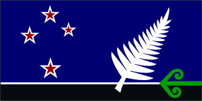
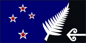
Note: The flags in the official referendum are shown on Page 3. My designs were not selected, but the points raised below are still worth considering in relation to the ones that were.It’s hard to find a flag that pleases everyone, because we all want different things – a fern, Southern Cross, kiwi, koru, a coloured flag, or black and white (plus, of course, the flag that we have). If we would consider the views of others, and be willing to compromise, then an acceptable design will be found. Some symbolic designs have no obvious link to New Zealand at all, and these are unlikely to fill us with pride. If we are going to change the flag, then it must be for good reason, and not just for the sake of having a new one.
As explained on Page 2, there are a number of reasons we should have a new flag. The most important thing is to have a flag that clearly represents New Zealand, so we can all feel proud of our national flag. (I think this matters a lot more than we realise). No matter how much our people might change, the land itself is timeless and that's what our flag should be. With all the things people say they want in our flag, my designs are an attempt to please most of us.
Bear in mind we can remember our British heritage with our old flags, and in various other ways (explained on Page 1), plus the blue did come from Britain. These designs would allow us all to go forward together as New Zealanders, with a flag that is clearly about this country.
IMPORTANT: I am not a professional designer, and your screen may not show the colours as intended, so please consider the designs as improvable "ideas" for a new flag. Poll on Page 6.
| A | 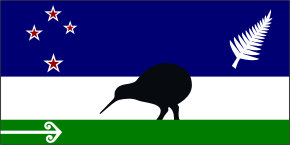 |
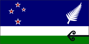 |
B |
| C | 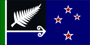 |
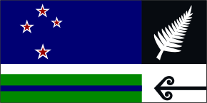 |
D |
| E | 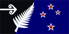 |
 |
F |
| G | 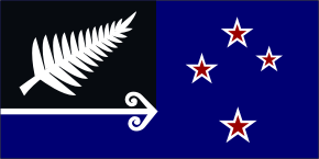 |
 |
H |
| I | 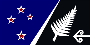 |
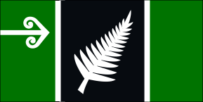 |
J |
| K | 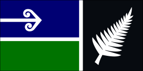 |
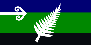 |
L |
| M | 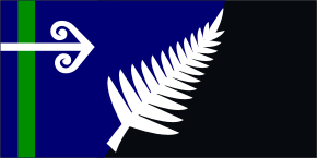 |
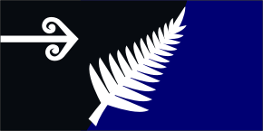 |
N |
| O |  |
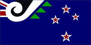 |
P |
| Q | 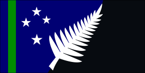 |
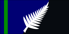 |
R |
| S | 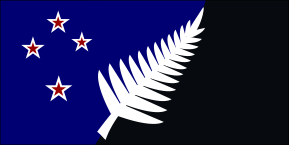 |
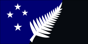 |
T |
| U | 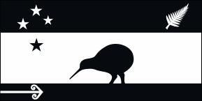 |
 |
V |
 |
Flags A & B C & D E & F G & H I & J K & L M & N O & P Q & R S & T U & V You can also see the flags flying.
And remember, the top-left quarter is the part we see most often.
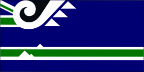
About the designs: Originally, I had only one design here (the kiwi flag in black and white), but I think too many people wouldn't be happy with a black & white flag. Like many of us, I much prefer brighter colours to represent New Zealand, but I also want a connection to our national sports colours and emblem (sadly missing with our current flag, especially at the Olympics), so the challenge was to create a number of designs that achieve both. I think some are better than others, and I don't imagine everyone will like them at first glance. I've had a few years to really decide if they're any good, and I do think one or two are worth considering. (You can see more about the ones I like best in the paragraph headed My Preference below).
Note: The fern and the koru on these flags are NOT the well-known brand logos, and are actually quite different. There are lots of variations of these symbols, used for different things or organisations, and all of these flag designs are my own amateur work. (Any improvements needed could be done professionally, but you can see the general idea). A national flag is not the place for fancy styling, so I have kept the fern and koru very basic.
Some examples of the infinite variety of ways our fern and koru are used in brand logos:
Fern: All Blacks, Interislander, KiwiRail, NZ Army, Silver Fern Farms
Koru: Air New Zealand, Age Concern, DOC, Ministry of Health, Radio NZ
Most of my designs include part of our current flag, and some use nature's colours of land and sea to convey our remoteness and natural beauty. The earlier designs all have a koru – not to favour Maori people, but to provide a strong "New Zealandness". That's what it means on the tail of our airplanes, the Department of Conservation logo, postage stamps etc, where the koru is clearly not just for Maori. I agree a flag for all of us can't be too Maori – or too British – but a simple koru (without the red, white and black combination) instantly says New Zealand. I deliberately made the koru "similar" to the well-travelled koru on our national and international airline, which I see as mutually beneficial. (Think of AirNZ as our national "flag-carrier", rather than the flag being about AirNZ). Many countries have part of their flag on their commercial airline – often a jazzed-up version of the design, so it won't matter which came first. Here are some examples: Britain Canada Israel South Africa Switzerland
With a fern and some black on our flag, we would wave our national flag at sports events, just like any other country. Some people are against a sporting image, and seem to forget that other countries' sports outfits have a link to their flags. For us, there is no connection at all. Once we provide that missing link, then suddenly our flag and our uniforms will make sense together. Waving separate flags at the Olympics etc creates confusion, and it's far better to have a constant identity that the world will come to know us by. If we include some brighter colour as well, we'd have a proper Flag of New Zealand that we'd proudly use for everything. The fern is easy to spot in a crowd, and when the flags are very small – have a look!
These are the kinds of flags the Australians are considering. Just as it makes sense for them to have green and gold, it is equally logical for New Zealand to include a fern and some black. It is pointless if we choose a new national flag that won't be used any more than our present one.


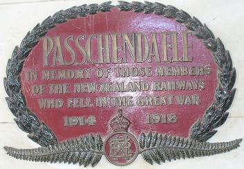
Although a fern is used for most of our sports (international), it is not just about sport (or the All Blacks, as some people think). The fern is about pride in our country, so it's used for many other things as well. The styles might be different, but the fern can be seen almost anywhere! (These ones here are just a few examples). The fern is prominent in our souvenir shops, and is known throughout the world. Our silver tree-fern is unique, and has been a symbol of New Zealand for a very long time. It can be seen on our official Coat of Arms, and on thousands of headstones in foreign military cemeteries, where New Zealanders were buried in the Wars. Wherever you see the fern, it says "Proudly New Zealand". That's what our flag needs to say.
 |
 |
 |
The silver fern in Nature: New Zealand has a notable abundance of ferns, including several large tree-ferns or ponga. One of these is unusual, with the underside of its leaves not green, but a silvery-white colour. The koru design comes from the coiled shape of the young shoots, before they unfurl to become beautiful large fern fronds. Silver fern and natural koru (This link also explains how we first came to use the fern – and why it belongs on our flag).
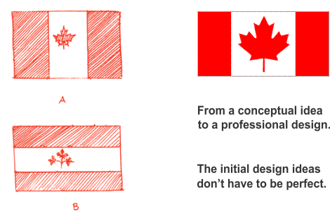
Some people say my designs are too complex, but if you look at each one individually, a few of them are really quite simple – eg. Flag J is not that different from Canada's flag. Although I like simple flags such as Canada's Maple-leaf, instant recognition is what really matters, and more-detailed designs can be just as effective (the Stars & Stripes of America, or Britain's Union Jack). The main thing is to have a design we can easily recognise, without any explanation at all. A flag unmistakeably about us will give us great pride and confidence. Most of all, I want a flag that will stir our emotions, because at last it can truly say to the world (and to us), "This is New Zealand, this is who we are – and we’re proud to be Kiwis".
Whether I have succeeded with any of these designs is for you to decide. (There's an easy way to say what you think on the page for Your Comments). As I said above, it's hard to find a flag that pleases everyone, so I'll be glad if at least one design appeals to you, even just a little! There are lots of flags in the world that are similar to others and easily forgotten, but the easiest flags to remember are the ones that stand out and have something different about them.
My preference: Flag E or Q of the ones with the Southern Cross; Flag M or V of the ones without it. These flags are bold and meaningful, and have ample colour as well as black & white (which is fair to both arguments). Flags get windblown and tattered on the right-hand side, so the stars of E are a bit more vulnerable to damage than the other designs.
These links explain my choices: Flag E Flag M, Q and R Flag V.
For those who don't want a silver fern, or still want the Union Jack, Flag O is a simple and conventional design, while Flag P shows our combined history. The green can be seen as fern leaves, or our three main islands. I've also added Flag V that includes our founding history.
Some people have suggested we just have the Southern Cross on blue, but we're not the only country that uses it. We have no control over what Australia or any other country might have in the future, plus it could easily be confused with the flag of Micronesia, shown below.


One viewer comment said: "How about just a silver fern on a black background as a choice?"
For the sake of comparison, here is what it looks like.

More importantly, think of this flag out in the middle of the ocean or in a war zone, where it could easily be misunderstood, or seen as a threat. Not everyone will know our flag as well as we do, and it's a serious risk to take. In those situations far from home, would you feel safe with this flag? My idea is that we should still have a fern (and have some black and white), but with colour added as well, our flag will feel joyful and alive. If you look at Canada's flag, it's the inclusion of nature and bright colour that make it so well-liked – not just simple design. Note also that their new flag has kept something meaningful from their old design (colour and leaf).
Those who say a black flag is the only acceptable option need to realise that this is one major reason others oppose a change of flag. A resolution is more likely to happen when we all start considering other people, and are willing to meet halfway. Of course, that also means others being prepared to accept a fern and some black! Try being open to other ideas, eg. if you had to choose a flag from the above, which one/s would it be? You might not get exactly what you want, but the more important aim is to find a flag that is acceptable to the majority of us.
Remember, these flags are just the ideas that I've come up with, and there are lots of different ideas to be found on many other websites. (It's a good idea to look at any designs on several occasions and compare with others, rather than dismiss them on first impressions). I think if flag designers take notice of what people want, then eventually someone will design a flag that most of us can like well enough, and ultimately, will feel proud of. And remember, any designs put forward can potentially be improved. Canada's flag was just a rough drawing when it was chosen for their new flag. A flag committee made a shortlist from over 5,000 designs that included beavers, geese and all kinds of variation in colour and design. Story via Index page.
What would make an ideal flag? I suggest the following is a good checklist to go through:
♦ That the design is not similar to any other flag (and unlikely to be later, eg. Australia)
♦ is viewable from either side
♦ is well away from the right-hand edge (some of my designs are too close)
♦ can easily be recognised hanging by the pole
♦ is recognisable in black & white (the best ones are, because of some unique feature)
♦ is easy enough for flag-makers to produce
♦ simple enough for school pupils to draw
♦ and a New Zealander living overseas would be stopped short if they saw it in China or Africa or wherever they might live, and just know it was a NZ flag.
It should also be our first choice to wave at any international events, and that's far more likely if it includes a fern and some black. I think any new flag that doesn't meet these criteria will cause ongoing dissatisfaction, and we would end up wanting to change it again. The right new design will give us a proper flag of New Zealand that should last forever.