coolnz.net – Flag M (can also apply to Flags Q and R below)

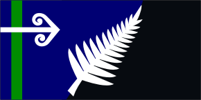
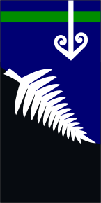
Flag M is a fresh and unique design that has always felt "right" to me. It's about New Zealand's natural beauty – oceans, lakes, mountains, and our native bush with the koru and fern. The green is our remote and fertile country between the Tasman Sea and Pacific Ocean. The black shows our night-and-day time-zones with the rest of the world, and reaches out to connect with New Zealanders overseas (including the ones who never came home). It also recognises our pride in being part of the much wider world. The koru and fern together stand for peace and unity; growth and inspiration; and having absolute pride in Aotearoa New Zealand. When the flag is hung vertically, the blue of the sea becomes a beautiful moon-lit sky, behind a fern and snow-clad mountain – very much a New Zealand image. To me, this flag feels like "home".

Including a fern and some black means our national flag would be the one that's seen in any crowds, and removes the need for separate black flags. Like it or not, this is our one chance to make a connection with our national colours. We should be known to the world by our official flag, and I see little point in changing to any design that would still take second place. When a lot of people want a black flag and others clearly don't, meeting halfway is a fair compromise.
Some people think these colours don't go well together, but they're the colours of our wildlife and magnificent scenery. I'd suggest Nature's beautiful colours are very right for this country. New Zealand is known for its natural beauty, and the Maori aspect that is uniquely ours. This is what I see when I look at this flag, and it makes my heart burst with pride in my own country.


|